February 9, 2014

We Made Logo

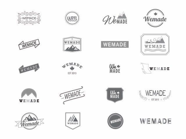
Before Christmas, I designed a logo for a new local company called We Made. They will be an online resource and directory for locally made goods in British Columbia, Canada. The client was looking for something illustrated and fun with a handmade look.

As with most projects, I started by sketching out my ideas in my sketchbook. Then I brought my ideas to the computer to explore more variations and ideas. I ended up doing several versions with different illustrated tools, colors and textures. The client choose a slightly different variation of this logo but I thought I would show my favorite version.

I had a lot of fun working on this logo and playing around with type. I will definitely let you know when the website is up and running.


February 3, 2014

Uppercase Issue 20

Like I said before, I wanted to post more things like my process and inspiration on my blog.  I would like to share one of my favorite magazine, Uppercase. The new issue arrived last week and I am very excited that this issue's theme is broadcasting.

In this issue, I really enjoyed the interview with Jason Munn who also designed the cover. I also enjoyed the articles on L'Affichiste which is a Montreal gallery specializing in antique fine art and decorative art posters from “Art Nouveau”, Art Deco and Contemporary .  Another article I really enjoyed, due to my love of type and letterpress,  is "The History of Hamilton Wood Type."

If you love design and crafts, I highly recommend this beautiful magazine.